🌟 Dell U3225QE Color Adjustment Guide | A Must-Read for Mac Users! Includes Perfect Settings Parameters 🌟
After spending an entire day fine-tuning, I’ve finally achieved a satisfying level of color accuracy on my new Dell U3225QE! 💻✨ As a designer, there’s simply no compromise when it comes to color precision.
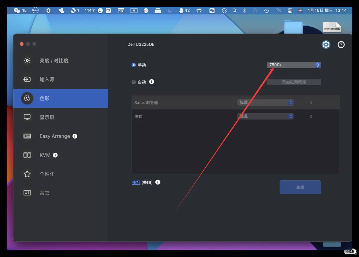
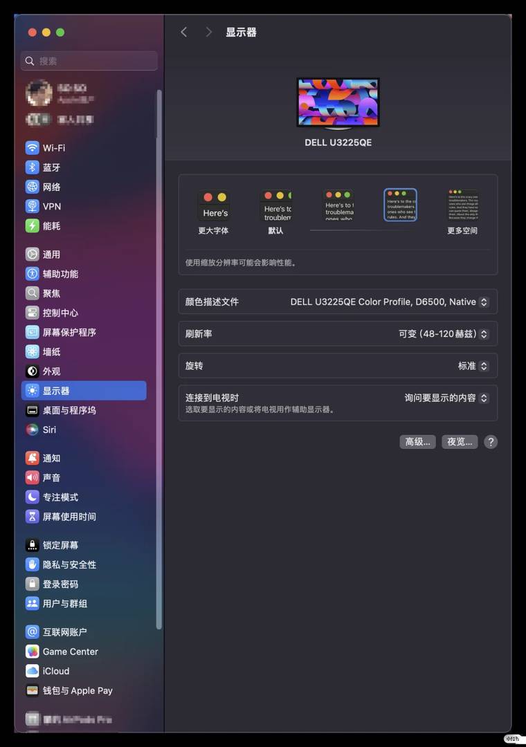
🔧 Essential Tips for Color Calibration (specific parameters on P6-P8):
✅ Manually adjust the color temperature to neutralize any unwanted yellowish tones. I settled on 7500k for a balanced look.
✅ Fine-tune the brightness and contrast levels to ensure clarity even in brightly lit environments.
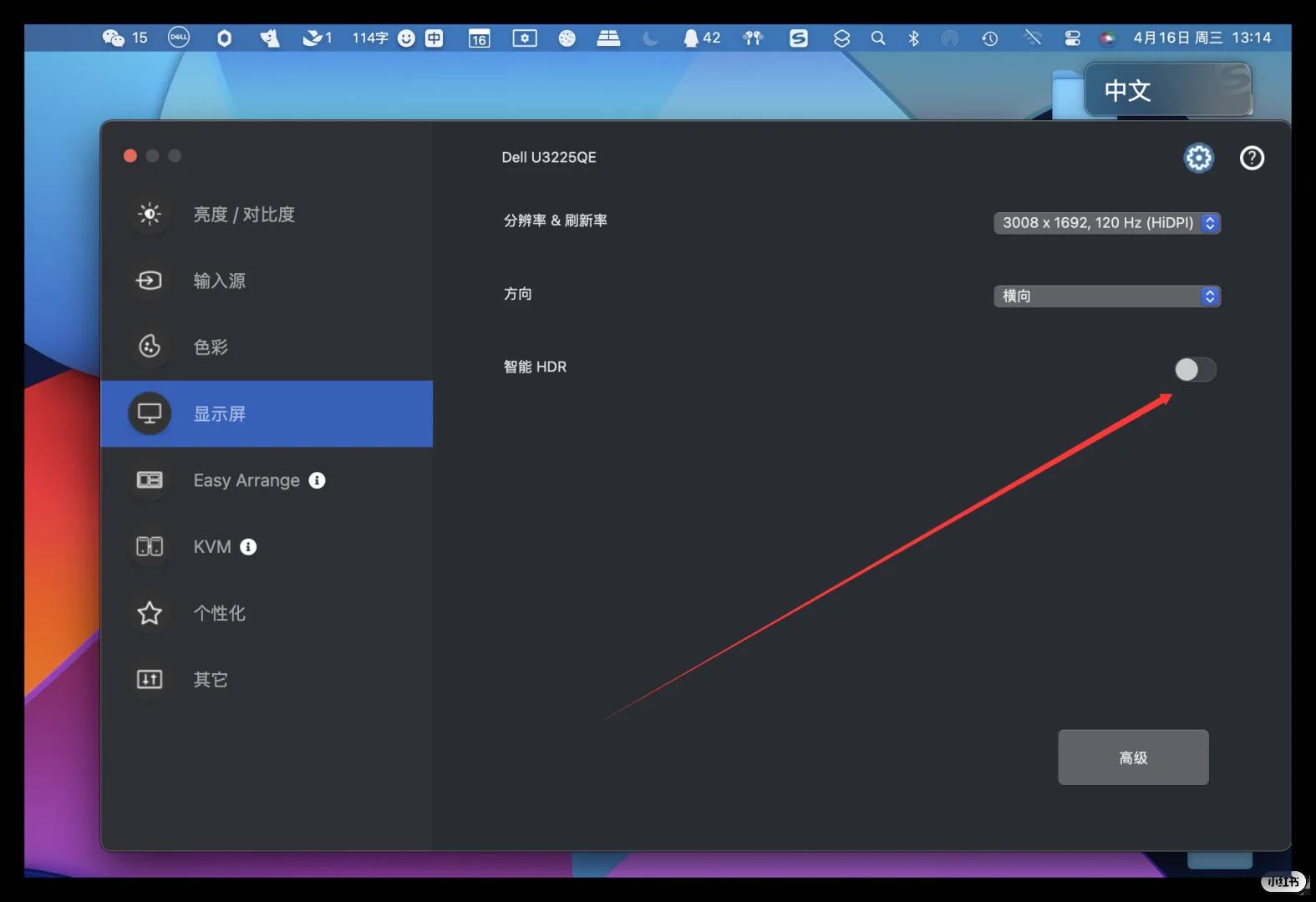
✅ Avoid enabling the monitor’s HDR mode—it tends to exaggerate contrast, leading to overexposed text and icons. Similarly, refrain from activating your Mac’s HDR mode, as this can result in a yellowish hue due to potential compatibility issues.
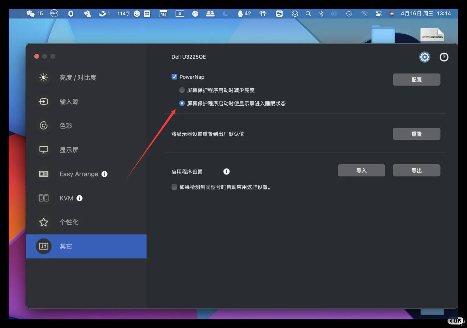
✅ Don’t rely on the screen saver feature to dim the display; once it lowers the brightness automatically, it often fails to restore it upon exiting, leaving manual adjustments ineffective (likely a bug).
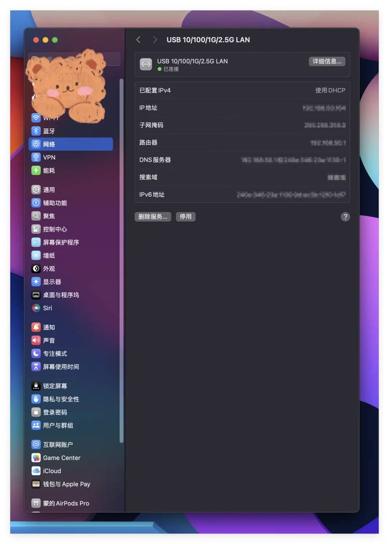
⚠️ Important Note for Mac Users:
The built-in 2.5G Ethernet port might not be recognized by your system. ❗️
👉 Fix: Update your drivers and restart your Mac (tested and confirmed effective).
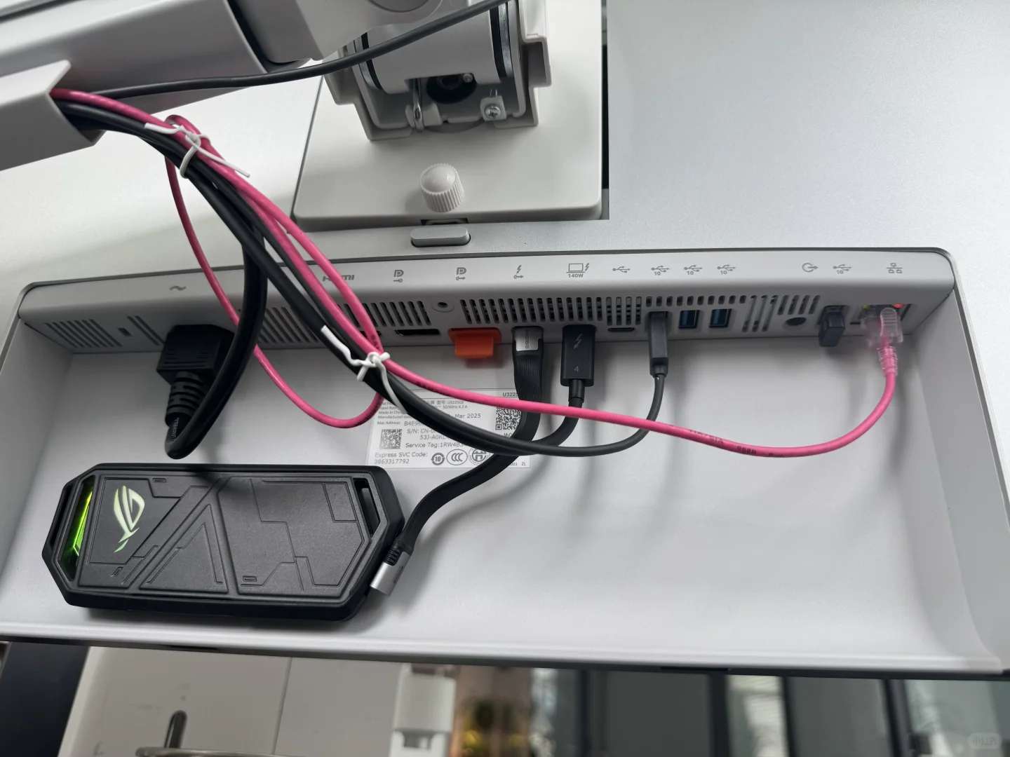
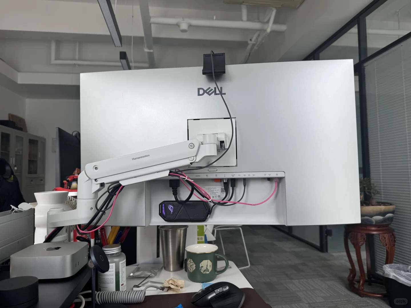
I must give credit where it’s due—this monitor boasts an impressive array of ports that cater to all my needs.
There are even hidden expansion ports tucked away at the bottom left corner (which, unfortunately, I didn’t capture in photos)! This feature alone eliminates the need for an additional docking station.
🎨 Check out the screenshot of my final settings in P1!
Struggling with color discrepancies on your monitor? Share your calibration experiences in the comments below—we’d love to hear from you!