第一次买戴尔的u系列专业设计显示器,但是发现白点值是偏黄的。查阅了很多笔记,都有反馈这个显示器发黄的问题。
由于个人要做图(色准),并且对护眼需求也比较高(干眼),这个价位貌似鱼与熊掌不可兼得。
[扯脸H]这种既要又要的状态下,目前只能通过校色来满足了。
家里刚好有老艺卓(屏幕护眼舒适),iphone11(屏幕护眼舒适),u2725qe(屏幕护眼舒适),正好用来对比一番。拍照颜色会有偏差,下面会顺带说明肉眼感受。
[抱拳R]以下均为个人使用感受,非严谨评测。
—————————————————————
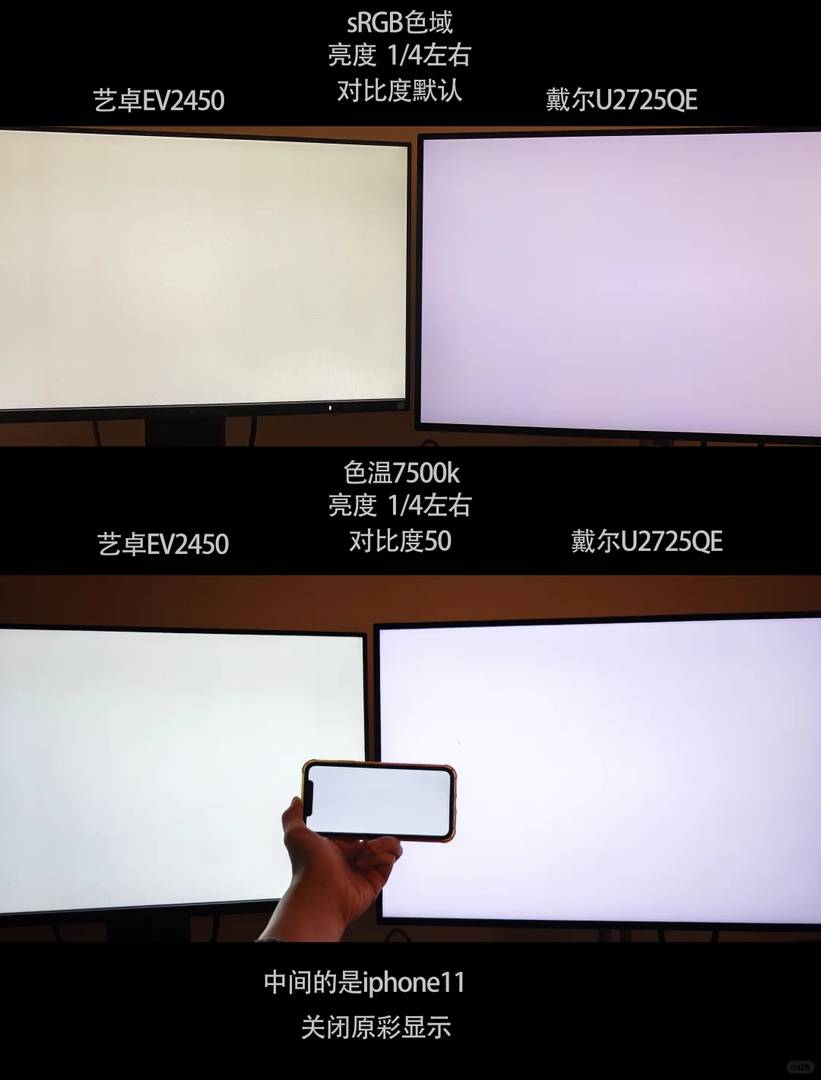
图1[笑哭R]
是srgb色域下,艺卓和戴尔对比图,明显艺卓的更黄(浓郁)。肉眼看也是一样,但是戴尔不是紫红,是淡黄。
图2[点赞R]
【u2725 调整色温7500k,对比度50,亮度25%左右】【艺卓7500k,亮度配合戴尔】【iphone11 关闭原彩显示,亮度配合戴尔】
在这个基础上,2725偏黄情况有明显改善,颜色上和iphone11很接近。艺卓但是会有点淡淡的黄(不明显)。这个状态下,肉眼看白点值的状态已经没有明显的偏色倾向。
结论:
调整色温7500k,对比度50,亮度25%以上。屏幕白点值的偏色会有明显改善。不过每个人的显示器情况不同,数据仅供参考,思路应该是可以通用。
—————————————————————
[吧唧R]思考:
1、在护眼已经是各大厂商主推的情况,屏幕的偏黄貌似已经是主流(除非不买硬件防蓝光)
2、干眼,近视,眼睛需要保护的人群,其实护眼更应该放在首位,有健康才有诗和远方。所以能买到色准的,也会调得偏黄来用吧?(护眼)[doge]
3、除非要做印刷类,或者是指定要求非常高的色准活。一般的做图用户(媒体图,短视频等),这种本身展示环境其实也有各种偏差(不同手机品牌,显示器型号,是无法统一各种屏幕偏色问题)。所以你做出来图,别人就一定有高色准的播放条件吗
4、有一个说法,本身6500k的色准就是偏黄的,7500k才是白。出厂是6500k为标准,所以看起来黄
5、提高亮度,能让偏色问题改善
6、我调白了,但是用了一段时间觉得有点辣。又换回偏黄这种状态了[笑哭R]
I totally get the struggle with the U2725QE’s yellow tint, especially since I also prioritize both color accuracy and eye comfort. It’s interesting how adjusting the settings improved the white balance, but you’re right that it might not work for everyone due to individual monitor differences. I wonder if there are any other calibration methods that could complement these adjustments for even better results?
Absolutely! In addition to software calibration tools like DisplayCAL or X-Rite’s i1Display Pro, you might consider using a hardware calibrator such as the Datacolor SpyderX Elite. These tools can provide more precise adjustments tailored to your specific monitor. It’s all about finding what works best for your workflow and preferences. Thanks for your thoughtful question—it’s clear you’re really invested in getting the best display experience!
I totally get the struggle with the U2725QE’s yellow tint, especially since I also prioritize both color accuracy and eye comfort. It’s interesting how adjusting the settings improved it, but as you said, everyone’s experience will vary. I wonder if newer models still have this issue or if they fixed it with firmware updates? Your point about balancing real-world use vs. strict color standards is spot-on.
I totally get the struggle with the U2725QE’s yellow tint, especially since I also prioritize both color accuracy and eye comfort. Your method of tweaking the settings to improve white balance seems practical, though I wonder if keeping the brightness a bit higher really solves the issue long-term. It’s interesting how different devices handle color differently—makes you rethink what “neutral” even means!
You’re absolutely right about the challenges of achieving neutral colors on the U2725QE! While higher brightness can help mitigate the yellow tint in certain environments, it’s important to find a balance that maintains eye comfort too. It’s fascinating how “neutral” is so subjective across devices—it really highlights the importance of calibrating to your specific needs. Thanks for sharing your thoughts—I agree, it’s a reminder to always trust our own eyes when fine-tuning displays!
I totally get the struggle with the U2725QE’s yellow tint—had the same issue when I first got mine. Your calibration tips are spot on, especially raising brightness to balance that out. It’s interesting how different users prioritize either color accuracy or eye comfort depending on their needs. I wonder if newer firmware updates address this issue at all?
Thanks for sharing your experience! You’re absolutely right about balancing brightness for better color accuracy. While I haven’t heard of any recent firmware updates specifically addressing the yellow tint, it’s always worth checking Dell’s support page for the latest changes. Great point about prioritizing either color accuracy or eye comfort—it really depends on individual preferences!
I totally get the struggle with the U2725QE’s yellow tint, especially for someone like me who needs both color accuracy and eye comfort. It’s interesting how adjusting the settings improved the white balance, but I can see why some might still prefer a warmer display. Your point about general users not needing extreme color precision is spot-on—most environments have inconsistencies anyway. I wonder if there’s a way to automate these adjustments more easily?
Absolutely, automating these adjustments could make things much easier! You might consider using software like DisplayCAL or even built-in calibration tools in Windows/macOS to streamline the process. It’s a great idea to find a balance between color accuracy and warmth based on your needs. Thanks for sharing your thoughts—it’s always helpful to hear from users like you!