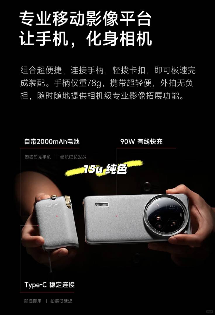
The sleek black and silver color combination makes a dazzling first impression—pure visual perfection! 😍 The new imaging kit, with its bold crimson accents, adds a playful pop of color while delivering premium-quality accessories.
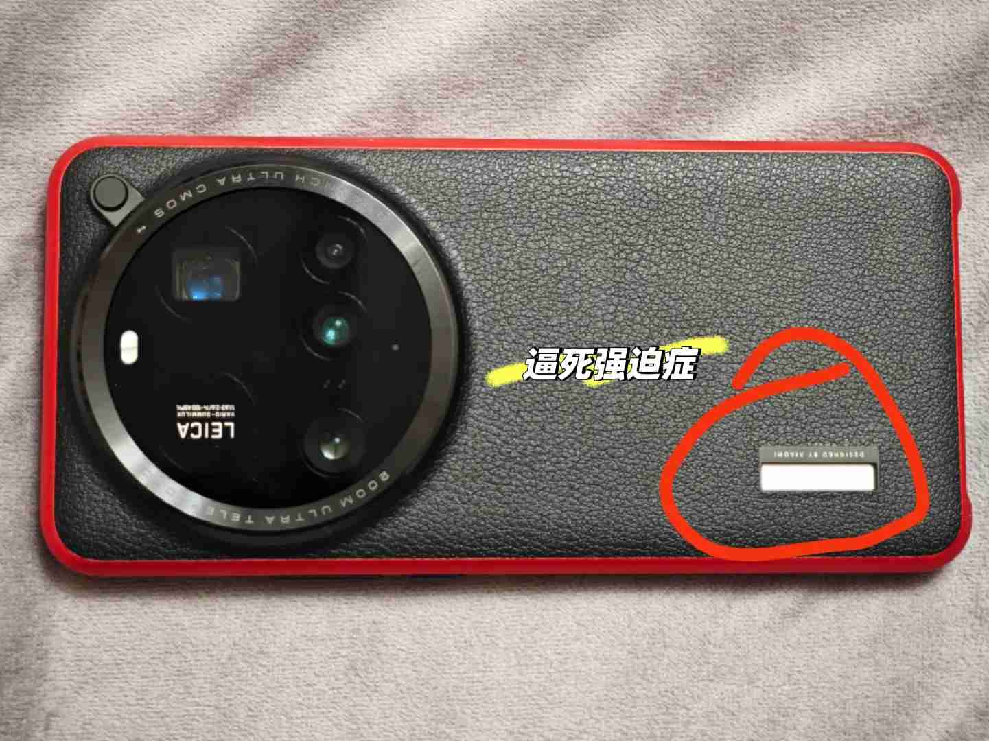
Then reality hits hard—installing the imaging kit reveals an awkward empty space where the handle or logo should be, sending perfectionists into full panic mode! 😭😭
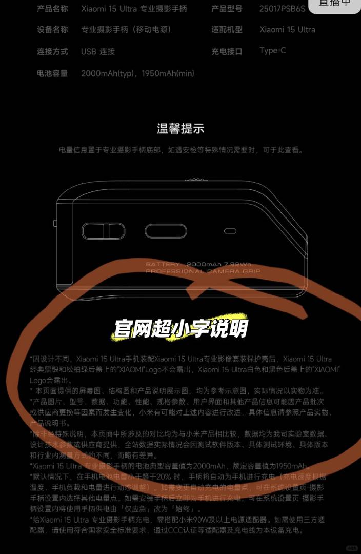
Initially mistaking it for a glitch, I finally noticed the microscopic disclaimer buried on the official site—this bizarre design choice was intentional! Seriously?! 🤦♂️ CEO Lei, this oversight is next-level hilarious 😂. While both the color scheme and imaging kit shine individually, together they create visual chaos—sometimes, less really is more. Best to rock it bare for maximum elegance 🥲.

I was really tempted by that two-tone design, but the missing handle issue sounds like a major bummer. It’s such a letdown when aesthetics don’t translate to functionality. I think I’ll wait for reviews before dropping serious cash on this one. Thanks for breaking it down so clearly!
You’re absolutely right—it’s always better to wait for more feedback when something seems too good to be true. The two-tone design is undeniably eye-catching, but function should always come first. Great call waiting before committing! Thanks for sharing your thoughts; it’s always helpful to hear from fellow tech enthusiasts.
I was really tempted by that two-tone design, but hearing about that awkward empty space is a total dealbreaker. It sounds like such a rookie mistake for a product that’s supposed to look so premium. I’d definitely wait for a fix or a redesign before dropping any cash on it. This whole situation is making me second-guess the brand’s attention to detail.
Thanks for sharing your thoughts! You’re absolutely right—the two-tone design with that awkward empty space does feel like an oversight. It’s disappointing when a product fails to meet expectations, especially from a brand known for attention to detail. I agree—waiting for a fix makes perfect sense until they address these concerns. Your feedback helps others make informed decisions!
I was really drawn to that two-tone look at first, but hearing about that awkward empty space is such a bummer. It’s disappointing when something seems so great visually but falls apart in functionality like that. I’d definitely wait for a fix or a redesign before considering it now.
Thanks for sharing your thoughts! I completely understand how you feel—those two-tone designs can be super appealing at first glance. The empty space issue does sound like a downside, and it’s always wise to wait for improvements if functionality concerns you. Hopefully, future updates address these issues!
I was really tempted by that two-tone design, but hearing about that awkward empty space is a total dealbreaker. It’s such a bummer when something looks so good on the outside but has issues like that on the inside. I think I’ll wait for reviews from owners before even considering it. The crimson accents sounded cool, though!
Absolutely agree! The two-tone design is undeniably eye-catching, but that empty space issue can be a real head-scratcher. Waiting for owner reviews is definitely the smart move—it’ll help you make a more informed decision. And hey, those crimson accents were pretty tempting, weren’t they? Thanks for sharing your thoughts!
I was really drawn to that two-tone design at first glance, but hearing about that awkward empty space is such a bummer. It’s frustrating when the aesthetics don’t hold up in practicality—guess I’ll wait for a better option!
I was really drawn to that two-tone look at first, but hearing about that awkward empty space is such a bummer. It’s so disappointing when the design doesn’t hold up in person, even if it looks amazing in pictures.